PRACTICAL SALES SOFTWARE GUIDE
10 Best Real-Time Sales Dashboards in 2026
Compare CRM-native and business intelligence dashboards by data freshness, integrations, reporting depth and cost. Learn what to verify before choosing a sales reporting setup.
In this guide Show sections
- Build Sales Dashboards That Track Growth | Strategic HubSpot Tutorial
- Quick Comparison
- 1. Salesforce Sales Cloud Dashboards
- Live Data Refresh Behavior
- Pipeline and Forecast Visibility
- CRM and Data Integrations
- Pricing and Team Fit
- 2. HubSpot Sales Hub Dashboards
- Live Data Refresh Behavior
- Pipeline and Forecast Visibility
- CRM and Data Integrations
- Pricing and Team Fit
- 3. Pipedrive Dashboards
- Live Data Refresh Behavior
- Pipeline and Forecast Visibility
- CRM and Data Integrations
- Pricing and Team Fit
- 4. Zoho CRM Analytics Dashboards
- Live Data Refresh Behavior
- Pipeline and Forecast Visibility
- CRM and Data Integrations
- Pricing and Team Fit
- 5. Microsoft Dynamics 365 Sales Dashboards
- Live Data Refresh Behavior
- Pipeline and Forecast Visibility
- CRM and Data Integrations
- Pricing and Team Fit
- 6. Tableau for Sales Analytics
- Live Data Refresh Behavior
- Pipeline and Forecast Visibility
- CRM and Data Integrations
- Pricing and Team Fit
- 7. Looker (Google Cloud) Sales Dashboards
- Live Data Refresh Behavior
- Pipeline and Forecast Visibility
- CRM and Data Integrations
- Pricing and Team Fit
- 8. Klipfolio / PowerMetrics
- Live Data Refresh Behavior
- Pipeline and Forecast Visibility
- CRM and Data Integrations
- Pricing and Team Fit
- 9. Databox for Sales Performance Dashboards
- Live Data Refresh Behavior
- Pipeline and Forecast Visibility
- CRM and Data Integrations
- Pricing and Team Fit
- 10. Monday Sales CRM Dashboards
- Live Data Refresh Behavior
- Pipeline and Forecast Visibility
- CRM and Data Integrations
- Pricing and Team Fit
- Which Tool Fits Your Sales Team’s Needs
- Best Tools for Small and Growing Sales Teams
- Best Tools for Multi-Source and Data-Heavy Environments
- Best All-in-One CRM and Dashboard Options
- Implementation Factors That Affect Dashboard Accuracy
- Pros and Cons of Each Platform
- Conclusion
- FAQs
- How real-time does a sales dashboard need to be?
- When should I choose a CRM dashboard over a BI tool?
- What data issues can make dashboard forecasts unreliable?
- Related Blog Posts
If you want the short answer: pick the tool that matches your team size, data setup, and how often you need updates. In this list, I’d put HubSpot, Pipedrive, and Monday Sales CRM near the top for smaller teams, Databox and Klipfolio in the middle for multi-tool reporting, and Salesforce, Tableau, and Looker at the high end for larger teams with tougher reporting needs.
Here’s the main takeaway in plain English:
- Salesforce Sales Cloud: best for large teams that already live in Salesforce
- HubSpot Sales Hub: best for small to mid-size teams that want fast setup
- Pipedrive: best for simple pipeline tracking
- Zoho CRM / Zoho Analytics: best for lower-cost reporting across many sources
- Microsoft Dynamics 365 Sales: best for Microsoft-based companies
- Tableau: best for teams that need CRM, finance, and product data in one place
- Looker: best for warehouse-based reporting with one set of metric rules
- Klipfolio / PowerMetrics: best for SaaS-based KPI dashboards
- Databox: best for easy multi-source sales reporting
- Monday Sales CRM: best for teams that mix sales work with delivery or onboarding
Before comparing dashboard speeds and costs:
- Do not assume a dashboard will increase revenue on its own; assess data quality, adoption and how the team acts on the information.
- Verify update intervals for the exact report type and connector; a live-looking dashboard is not necessarily continuously refreshed.
- Set a freshness requirement for each decision, then test it with the data source and subscription plan you intend to use.
- Entry pricing starts around $9–$14 per user/month
- Higher-end BI and CRM setups can run from $150/user/month to $5,000+/month
What I’d check first:
- Update speed: Is it live, every few minutes, hourly, or daily?
- Pipeline view: Can you see stages, deal movement, and stalled deals fast?
- Forecasting: Does it show weighted pipeline, commit, best-case, or AI-based calls?
- Integrations: Can it pull from your CRM, billing, product, and marketing tools?
- Setup work: Can your team launch it in hours, or will it take weeks?
- Price: Does the cost stay in range as users and data sources grow?
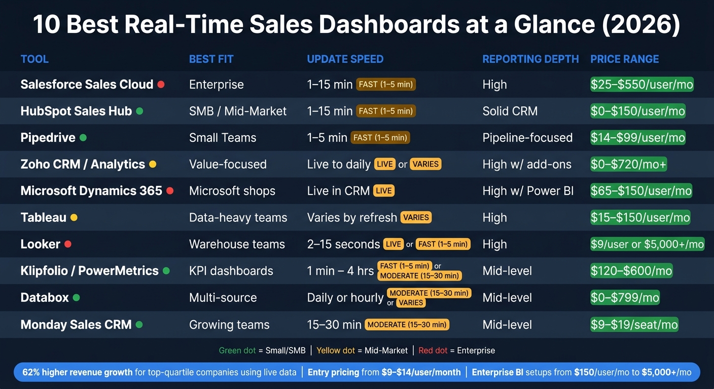
10 Best Real-Time Sales Dashboards: Side-by-Side Comparison (2026)
Build Sales Dashboards That Track Growth | Strategic HubSpot Tutorial
sbb-itb-8aac02d
Quick Comparison
| Tool | Best Fit | Update Speed | Reporting Depth | Price Range |
|---|---|---|---|---|
| Salesforce Sales Cloud | Enterprise | Depends on dashboard and refresh configuration; check Last Refreshed. | High inside Salesforce | $25–$550/user/mo |
| HubSpot Sales Hub | SMB / Mid-market | Custom reports: automatic refresh every 2 hours; manual refresh available every 15 minutes | Solid CRM reporting | Free or paid plans; onboarding may apply |
| Pipedrive | Small teams | Depends on view; shared-link default for another user is 1 hour. | Pipeline-focused | €14–€79/seat/month, annual billing |
| Zoho CRM / Analytics | Value-focused teams | Connector- and plan-dependent | High with add-ons | Separate CRM and Analytics subscriptions; obtain regional prices |
| Dynamics 365 Sales | Microsoft shops | Live in CRM; slower in BI | High with Power BI | $65–$150/user/mo |
| Tableau | Data-heavy teams | Depends on refresh setup | High | Standard starts at $15/user/month, annual; Creator also required |
| Looker | Warehouse-based teams | Warehouse ingestion, queries and caching | High | Looker: quote. Data Studio Pro is a separate product. |
| Klipfolio / PowerMetrics | KPI dashboard users | 1 min to 4 hrs | Mid-level | Klips: $120–$600/month, annual. PowerMetrics priced separately. |
| Databox | Easy multi-source reporting | Daily or hourly | Mid-level | Free; paid plans from $71/month, annual; custom tier available |
| Monday Sales CRM | Growing teams | Verify the exact dashboard and source | Mid-level | €12–€28/seat/month, annual; Ultimate quoted |
Bottom line: if your sales data mostly lives in one CRM, a CRM-native dashboard is often enough for streamlining sales processes. If your numbers come from many systems, I’d look at a BI tool or a dashboard app with stronger data blending.
1. Salesforce Sales Cloud Dashboards
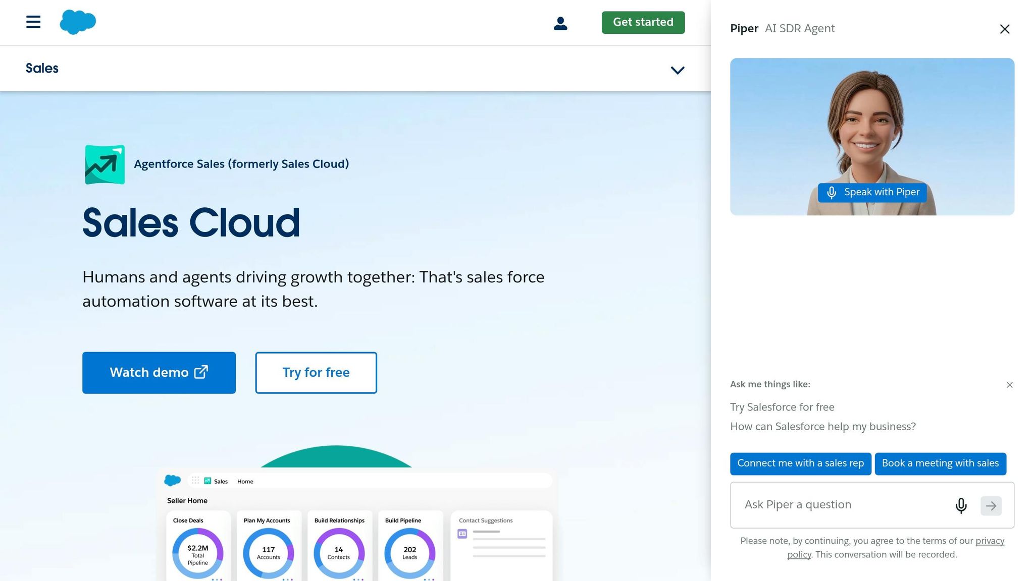
Salesforce is usually the better fit for teams that want tight, governed reporting inside the CRM instead of in a separate analytics tool. That’s a big reason Salesforce Sales Cloud shows up so often in enterprise setups for pipeline and forecast dashboards.
Its Lightning Dashboard Builder lets managers click from a KPI tile straight into the underlying Opportunity, Lead, or Account records, using sales pipeline best practices for forecasting. In practice, that means sales leaders can move from a high-level number to the deals behind it without bouncing between tools. Many teams also treat Salesforce as the main source of truth for forecasting, which helps keep pipeline data current.
Live Data Refresh Behavior
Salesforce documents a manual dashboard refresh and a “Last Refreshed” indicator. Do not assume a universal automatic update interval for every dashboard. Check the specific dashboard, viewing context and refresh configuration you will use, then measure the delay between a changed opportunity and the report. A minimum interval between refresh requests is not a promise that dashboards refresh automatically at that interval.
Pipeline and Forecast Visibility
Salesforce makes it simple to show current pipeline status, including open deals, stage mix, and weighted value. But there’s a catch with stage history. If you want stage conversion or stage-aging metrics, you’ll need OpportunityHistory or a warehouse export.
CRM and Data Integrations
The tradeoff is that data outside the CRM can stay stuck in its own lane. Native Salesforce reports are clean and easy to manage inside Salesforce, but they don’t easily join billing, product-usage, or support data. Data Cloud can pull those sources together into a single forecast.
Pricing and Team Fit
| Plan | Price | What’s Included |
|---|---|---|
| Starter Suite | $25/user/month | Lead, Account, and Opportunity management |
| Pro Suite | $100/user/month; annual billing | Adds sales quoting and forecasting |
| Core | $195/user/month; annual billing | Advanced pipeline management and deal insights |
| Advanced | $395/user/month; annual billing | Check the quoted AI, security and support entitlements |
| Max | $550/user/month; annual billing | Check included AI usage, products and add-on limits |
Salesforce tends to make more sense for larger teams that already run on the platform and have a dedicated admin. For teams with fewer than 10 reps, it can feel heavy and harder to manage than it’s worth.
2. HubSpot Sales Hub Dashboards
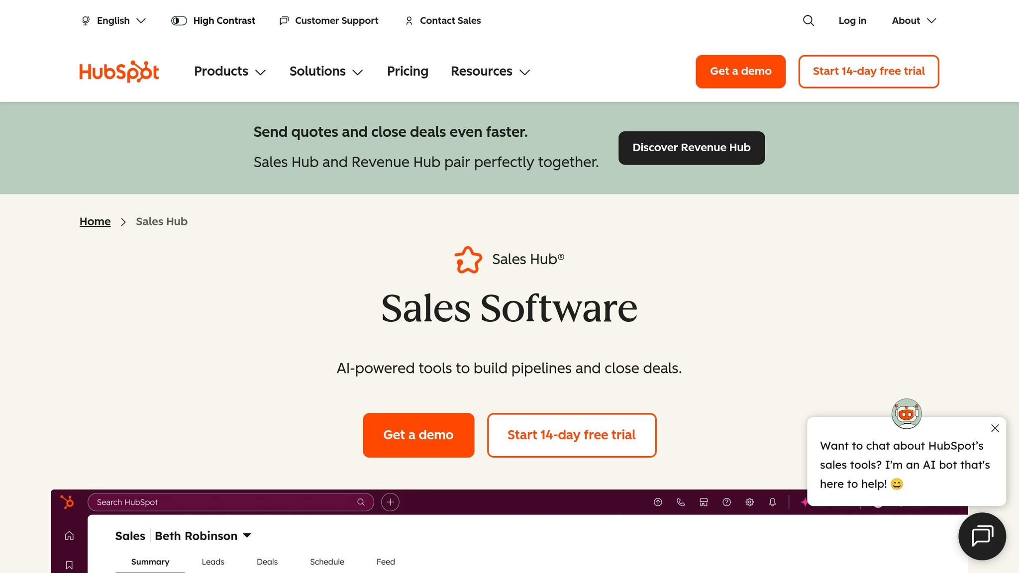
HubSpot Sales Hub can be evaluated for reporting on data already held in HubSpot. This guide does not establish a measured setup-time advantage over Salesforce. Time to a usable dashboard depends on field quality, permissions, report definitions and any connected sources.
Live Data Refresh Behavior
For reports created with HubSpot’s custom report builder, automatic refresh runs every two hours. A report or dashboard can also be refreshed manually once every 15 minutes. HubSpot notes that new data can take 10–15 minutes to appear in reports. These are different stages of data freshness, not a blanket 1–5 minute update interval for every dashboard. Check the report type and connected data source before relying on it for time-sensitive decisions. Source: HubSpot custom report documentation (checked 30 September 2026).
Pipeline and Forecast Visibility
Out of the box, HubSpot gives sales managers the core views they usually need: deal performance, sales funnel metrics, pipeline velocity, stage-based deal views, and activity timelines for calls, emails, and meetings.
One area where HubSpot works well is role-based dashboards. Instead of forcing everyone to stare at the same screen, it lines up views with each team’s day-to-day job.
| Dashboard Type | Primary Audience | Key Metrics Tracked |
|---|---|---|
| Sales Rep | Individual contributors | Meetings booked, open opportunities, personal quota attainment |
| Sales Manager | Team leads | Team visibility, coaching insights, pipeline mix, daily vs. monthly stats |
| Executive | Executives | Revenue forecasts, strategic KPIs, high-level trends |
| Activity | SDR managers | Calls made, emails sent, connect rate, meetings booked |
By 2026, HubSpot also includes “Projected Landing” AI forecasting. It uses historical conversion rates and current pipeline velocity to predict period-end results. That helps move the story from rep activity to forecast confidence without making managers piece it together by hand.
CRM and Data Integrations
HubSpot works best when sales data lives in one CRM. Native CRM reporting is solid, but once you want revenue views pulled from several sources, you’ll still need extra modeling. Integrations include Google Analytics for web-to-lead tracking, email and call tools for activity data, and accounting systems that line up closed-won deals with booked revenue.
Pricing and Team Fit
| Tier | Estimated Cost | What You Get |
|---|---|---|
| Free | $0 | Basic pipeline dashboards and activity metrics |
| Starter | Check current regional offer | Entry pricing is promotion- and billing-dependent |
| Professional | From $90/seat/month, billed annually | Required one-time onboarding: $1,500; verify reporting and AI entitlements |
| Enterprise | From $150/seat/month, billed annually | Required one-time onboarding: $3,500; verify reporting limits |
HubSpot makes the most sense for small to mid-size teams that want marketing and sales data in one place without heavy IT help. But when reporting gets more layered – especially with multi-source data modeling – dedicated BI tools start to look like the better fit.
3. Pipedrive Dashboards
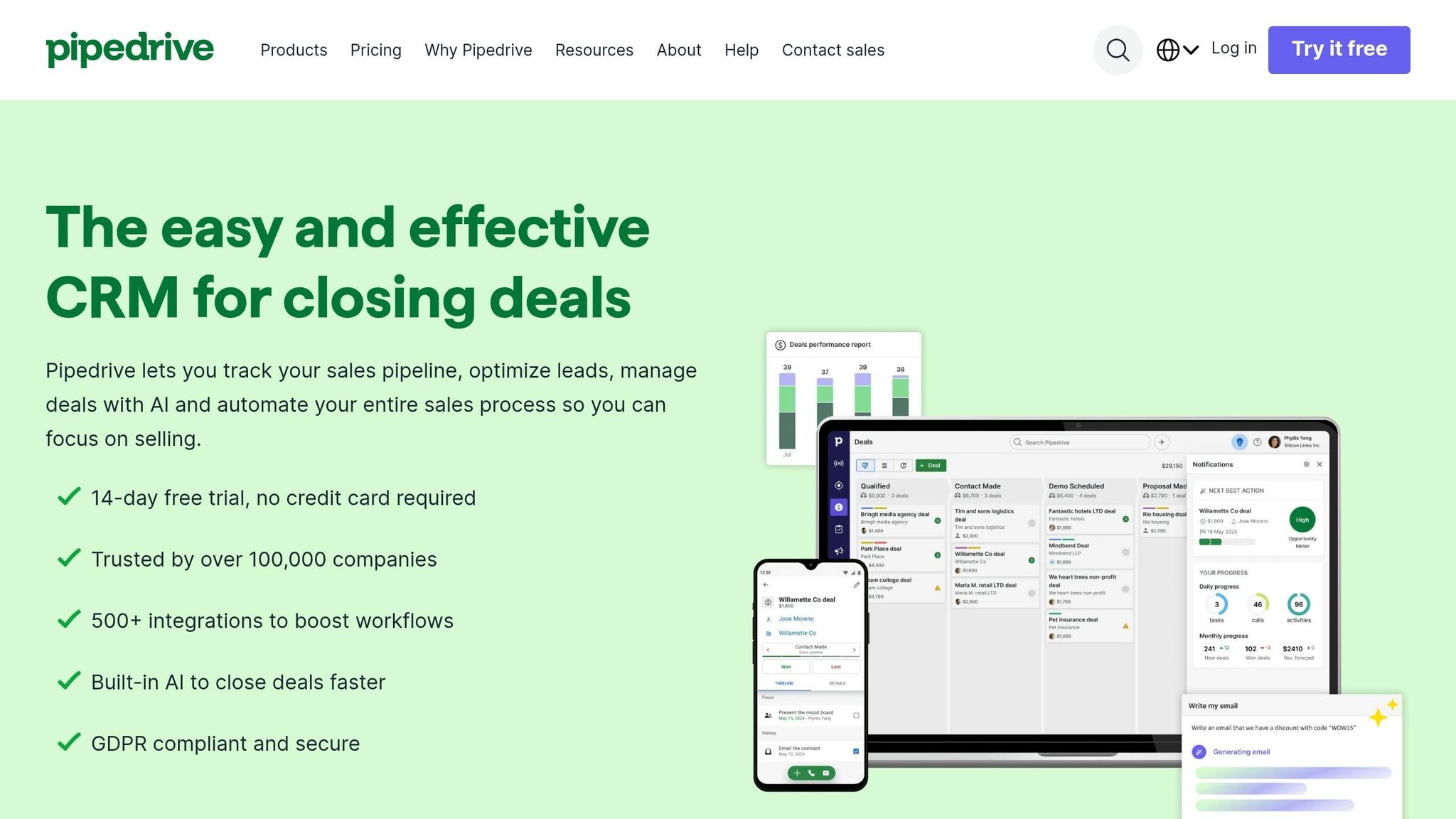
Pipedrive puts visual pipeline tracking front and center, which makes it a solid pick for teams that want sales reporting without a long setup process. While HubSpot stretches into broader CRM reporting, Pipedrive stays locked on pipeline-first visibility. Put simply, it works best for teams that want visual, low-friction sales dashboards without the extra weight of more complex reporting.
Live Data Refresh Behavior
Pipedrive distinguishes shared dashboard links from other reporting views. Its documentation says that another user opening a shared link sees a default one-hour update interval. The link creator can configure the interval under the documented conditions. Test the exact internal or shared view your team will rely on; do not treat a change in a deal record as proof that every report has already refreshed.
Pipeline and Forecast Visibility
The main view is a Kanban-style Deal Dashboard that shows open opportunities across set stages. It’s easy to scan, which matters when managers need to spot movement fast instead of digging through menus.
On the drag-and-drop Insights page, teams can pull in activity, outcome, and pipeline metrics like:
- new deals
- activities completed
- won/lost deals
- top performers
- win rates
- sales velocity
- deals per stage
Forecasting also includes forecast KPIs and interactive charts that show probability-weighted forecast amounts based on deal probability.
Reports can be filtered by time range, owner, and pipeline. You can also resize and rearrange them on the dashboard, which helps teams shape views around how they actually work. The trade-off is pretty clear: Pipedrive has weaker support for complex modeling, especially when you need advanced calculated fields or multi-table joins.
CRM and Data Integrations
Pipedrive connects with email, ads, automation, and workflow tools, but the reporting layer still leans heavily on Pipedrive CRM data. That makes it a strong option for operational sales reporting. It’s less suited for broader BI-style analysis that pulls from many data sources at once.
Pricing and Team Fit
| Plan | Price (per user/mo, billed annually) | Key Dashboard Features |
|---|---|---|
| Lite | €14 | Pipeline management; verify the reports needed |
| Growth | €39 | Forecast reports; verify limits for the quoted setup |
| Premium | €59 | Enhanced reporting and field customization |
| Ultimate | €79 | Sandbox and enhanced security controls; verify requirements |
Pipedrive fits small and mid-size teams that care most about pipeline visibility and straightforward sales reporting. If a team needs deeper analysis across many sources, this is usually where CRM-native reporting starts to show its limits.
4. Zoho CRM Analytics Dashboards
Zoho handles sales reporting in two places: Zoho CRM for live, day-to-day dashboards, and Zoho Analytics for deeper analysis across multiple sources. That setup matters when a team needs two things at once: instant CRM visibility during the workday and heavier reporting on top of that data.
Live Data Refresh Behavior
Separate native Zoho CRM reporting from the Zoho Analytics connector. The documented Zoho CRM connector offers daily sync on Basic, shorter scheduled intervals on higher plans and real-time sync on Enterprise. Other connectors can have different limits; test the exact source and plan. The table below covers Analytics, not CRM.
If a team needs true real-time visibility, Live Connect can pull data straight from databases and cloud services, so each new transaction shows up right away. Zoho also adds Zia into the mix. Zia can flag anomalies, like sudden drops in leads, and generate insights automatically, which helps keep alerts tied to sales lead generation solutions tied to live activity instead of old snapshots.
That live reporting layer supports the pipeline and forecast views below.
Pipeline and Forecast Visibility
Zoho Analytics comes with 75+ sales reports that cover win/loss rates, deal velocity, pipeline coverage, weighted forecasts, and expected-close-date forecasts.
A few reports stand out for day-to-day sales review:
- Deal Aging reports show stalled opportunities
- Conversion Funnels show bottlenecks at specific stages
- Pipeline Summaries group deals by stage for a quick read on pipeline health
Teams can also build charts with a drag-and-drop builder or use Ask Zia to create them from plain-language prompts.
CRM and Data Integrations
Zoho gets more useful when teams mix sales data with data from other systems. It connects with major CRMs and 500+ sources, including Google Analytics, QuickBooks, BigQuery, Snowflake, and Redshift. That makes it a strong option for teams that want sales, finance, and marketing reporting in one place.
Estimate implementation from your own data: identify sources, map identifiers, define metrics and reconcile one report before scaling. This guide has not measured a typical implementation duration for Zoho Analytics.
Pricing and Team Fit
| Plan | Price | Key Details |
|---|---|---|
| Basic | Regional price not verified | 2 users; 0.5 million rows |
| Standard | Regional price not verified | 5 users; 1 million rows |
| Premium | Regional price not verified | 15 users; 5 million rows |
| Enterprise | Regional price not verified | 50 users; 50 million rows; request a quote for additional capacity |
Zoho also offers a 15-day free trial with no credit card required. It tends to fit best when Zoho CRM is the main system of record.
5. Microsoft Dynamics 365 Sales Dashboards
Dynamics 365 Sales is a strong fit for teams that want live pipeline and forecast reporting inside the CRM. That’s even more true if they already use Microsoft 365. It plugs into Microsoft 365, Outlook, Teams, Power BI, and Entra ID, so managers can check current pipeline and forecast data without bouncing between tools.
Live Data Refresh Behavior
Native Dynamics 365 dashboards update from CRM records and charts as data changes. So if a rep edits an opportunity, the dashboard can reflect that change right in the CRM.
Once Power BI enters the picture for deeper reporting, the refresh setup shifts a bit:
- Import Mode refreshes on a schedule, with up to 8 refreshes per day on a Pro license.
- DirectQuery is real time, but it can be slower and tougher to manage. Import Mode usually gives the better speed-to-freshness tradeoff for most teams.
That difference matters. Native dashboards feel immediate, while Power BI reports may depend on the refresh schedule unless you use DirectQuery.
Pipeline and Forecast Visibility
After data freshness, the next thing that matters is simple: can managers see what’s coming and make a call fast?
The Opportunity Pipeline View shows deals by probability, close date, and revenue. Managers can also group opportunities by territory, owner, or stage right in the view. That makes it easier to spot where deals are piling up or where a region is starting to slip.
Forecasting includes weighted pipeline views, best-case and commit scenarios, and trend comparisons between forecasted and actual revenue. If a manager wants a fast visual without building a report from scratch, Visualize with Copilot can turn any grid view into a chart from plain-language prompts. The native funnel chart supports up to 50,000 records.
CRM and Data Integrations
Dynamics 365 works best for Microsoft-first teams. If the job is broader than CRM reporting, Power BI does the heavy lifting.
The Dataverse connector is the recommended way to connect Dynamics 365 data to Power BI, replacing older deprecated connectors. Use Power BI when sales reporting needs to pull in CRM, marketing, and finance data together.
Cross-source reporting needs a documented integration and reporting design. Power BI is one option; it is not the only possible approach. Separate native Dynamics dashboards from imported Power BI models, DirectQuery and other refresh modes. Obtain a scoped implementation estimate rather than assuming a standard number of hours or consulting fee.
That’s the tradeoff in plain English: if your company already lives in Microsoft, this setup feels natural. If your reporting stack is mixed, the extra work can stack up fast.
Pricing and Team Fit
| Plan | Price | Notes |
|---|---|---|
| Sales Professional | $65/user/month | Core sales force automation |
| Sales Enterprise | $105/user/month | Advanced customization and AI insights |
| Sales Premium | $150/user/month | Prebuilt intelligence for managers |
| Power BI Pro | $14/user/month, paid yearly | A separate reporting license; sharing and refresh options depend on the licensing setup |
Validate one representative Dynamics dashboard before estimating the rollout. Confirm access roles, refresh behaviour and the additional reporting licenses or services required. Existing Microsoft tooling may help, but it does not establish lower implementation cost without a scoped comparison.
6. Tableau for Sales Analytics
Tableau is a good fit for sales teams that need dashboards across many data sources, not just CRM reporting. It tends to work best when pipeline data needs to live next to finance, product, or warehouse data. Once a team starts to outgrow what CRM-native dashboards can do, Tableau often becomes the main reporting layer.
Live Data Refresh Behavior
For a Tableau extract, freshness depends on its refresh configuration. Full refresh replaces the extract; incremental refresh can append rows and, with a configured subrange, re-extract recent data. Test backdated edits and deletions against the chosen method. Select a reconciliation and full-refresh schedule from those results, not a universal weekly rule.
Pipeline and Forecast Visibility
After the refresh setup is in place, Tableau’s big advantage is drilldown. Users can go from a KPI straight into the deal records behind it without writing SQL. For sales managers, that’s a big deal. If a region is slipping, they can inspect the underlying pipeline instead of waiting for the BI team to send a report.
Tableau’s own guidance also says each view should stay focused on 5–7 KPIs. That limit helps keep dashboards clear instead of turning them into a wall of charts.
CRM and Data Integrations
This matters most when sales reporting has to pull together pipeline, billing, and ops data in one place. Tableau connects to Salesforce, HubSpot, Excel, Google Sheets, Snowflake, Amazon Redshift, and BigQuery. That range gives teams a lot of room to work.
The tradeoff is setup. When you combine sources like Salesforce pipeline data and billing data from a warehouse, you usually need data modeling support. It’s not plug-and-play.
A common setup is to sync Salesforce data into a warehouse with ELT tools, then let Tableau query the warehouse instead of hitting the CRM directly. That can help avoid Salesforce API limits and gives teams more control over refresh timing.
Pricing and Team Fit
| License Type | Price | Notes |
|---|---|---|
| Viewer | From $15/user/month, billed annually | Standard edition entry price; not the cost of a complete deployment |
| Creator | Check edition-specific quote | At least one Creator is required per deployment |
| CRM Analytics (formerly Tableau CRM) | Separate product; price not verified | Do not treat this Salesforce add-on as a Tableau Viewer license |
Tableau tends to make the most sense for teams with 50+ reps in data-heavy setups. For smaller teams, the license cost and setup work often outweigh the upside.
7. Looker (Google Cloud) Sales Dashboards
If your team keeps sales data in a warehouse, Looker turns governed metrics into live dashboards. The big idea is simple: define sales metrics once, then use those same definitions everywhere. Looker does this with LookML, a code-based semantic layer that keeps pipeline, win rate, and revenue consistent across dashboards.
That matters most when sales, finance, and operations all need to work from the same revenue number. Without that shared logic, one dashboard says one thing, another says something else, and suddenly everyone’s arguing about math instead of making decisions.
Live Data Refresh Behavior
Looker can serve cached query results or query the database according to its configuration. Freshness also depends on when upstream data reaches the warehouse. Coordinate cache policies with ingestion and test a known record change. This article has not benchmarked query latency and does not promise a seconds-level response time.
Teams can also use LookML datagroups to line up dashboard caching with ETL cycles. In plain English, that helps dashboards refresh at the right time instead of pulling data too early or too often.
Pipeline and Forecast Visibility
Managers can use Looker Explores to drill from governed KPIs down into deal-level rows without changing how metrics are defined. That’s a big deal for forecast reviews. You can start with a high-level number, then dig into the actual deals behind it, all without breaking metric consistency.
In 2026, Gemini-powered natural language querying also lets users ask ad hoc questions against the governed model. So instead of building a new report from scratch, someone can ask for what they need in plain language.
There’s one catch: dashboard design matters. Google recommends keeping dashboards to 8 to 12 focused tiles because each tile sends its own query. Go past that, and performance can start to drag.
CRM and Data Integrations
This setup only works well when warehouse and CRM data are modeled cleanly. Looker connects natively to BigQuery and also works with Snowflake, Azure SQL, PostgreSQL, and MySQL through connectors.
For CRM data, document the full route from the source system into the reporting layer. Connector availability, ingestion frequency and permissions are separate requirements. Verify the supported integration and its limits instead of assuming a universal 15-minute refresh.
A Looker implementation needs an agreed modeling and ownership process. Scope the required sources, metric definitions, permissions and maintenance skills before estimating delivery. This guide has not established a typical rollout duration.
Pricing and Team Fit
| Product | Price | Best For |
|---|---|---|
| Data Studio Pro (formerly Looker Studio Pro) | $9/user/project/month; subscription terms apply | A separate reporting product from Looker |
| Enterprise Looker | Contact sales: platform and user licensing | Governed reporting; obtain a scoped quote |
8. Klipfolio / PowerMetrics
For teams that want a simpler, SaaS-first dashboard tool instead of a full BI stack, Klipfolio is a lighter pick. Klipfolio offers Klips for visual dashboards and PowerMetrics for consistent KPI definitions. PowerMetrics keeps revenue, pipeline, and attainment definitions aligned across reports, which matters when the same sales KPI needs to match across dashboards, alerts, and team views.
Live Data Refresh Behavior
The published Klips plans range from four-hour refreshes on Base to up-to-the-minute refreshes on Team+. Verify source API limits and the subscription conditions. No separate refresh add-on price is validated in this comparison.
Pipeline and Forecast Visibility
Klipfolio brings together CRM data from Salesforce or HubSpot with targets from Google Sheets or Excel in one dashboard. So if a sales manager wants to stack pipeline progress next to quota or forecast targets, that’s easy to do.
It also supports TV dashboards for live leaderboards and KPI displays.
CRM and Data Integrations
Klips supports 130+ connectors, while PowerMetrics offers 100+ native integrations, including Salesforce, HubSpot, Pipedrive, Google Drive, and OneDrive. The platform leans on API connectors instead of direct SQL querying, which fits teams that work mainly from SaaS tools rather than a data warehouse.
For more custom setups, it also supports raw APIs, databases, and spreadsheets.
Pricing and Team Fit
That mix of speed, connectors, and metric control comes with mid-market pricing. Klipfolio’s Klips plans are billed annually from $120/month to $600/month.
| Plan | Price (Annual Billing) | Dashboards | Refresh Rate |
|---|---|---|---|
| Base | $120/mo | 3 | Every 4 hours |
| Grow | $190/mo | 10 | Every 1 hour |
| Team | $310/mo | 20 | Every 15 minutes |
| Team+ | $600/mo | 40 | Every minute |
Evaluate Klipfolio with your own metrics and connectors. If you also consult G2, check the actual product listing, review date and sample. This article has not verified a current rating or review count.
The tradeoffs are pretty clear too: Klips can take more time to learn, and the platform does not offer row-level security.
9. Databox for Sales Performance Dashboards
Databox sits in a useful middle spot. It gives teams more room than built-in CRM dashboards, but it doesn’t come with the heavy lift that often comes with BI tools. That makes it a good fit for sales managers and RevOps teams that want dashboard reporting up and running without a long setup process.
More than 20,000 businesses and agencies use Databox. And if speed matters, this is where the tool stands out: its drag-and-drop builder and 200+ templates help teams launch first dashboards fast.
Live Data Refresh Behavior
Databox lists daily source synchronization for Free and hourly synchronization for Analyst, Team Core and Team Scale. Treat those as plan limits, not proof that every upstream source is current. Check the connector and the metric timestamps.
That setup makes Databox a better fit for management reporting than for live wallboard use. If a team needs second-by-second updates on a big sales floor, this probably isn’t the right tool.
Pipeline and Forecast Visibility
Databox covers the sales metrics most teams care about, including:
- weighted pipeline
- deals by stage
- pipeline velocity
- qualifying inbound leads by source
- deals created vs. won
Databox now lists Genie AI Analyst across its plan comparison, including Free. Ask which questions, metrics and usage allowances are supported on the quoted plan. Do not assume that an AI-generated explanation proves why a metric changed.
CRM and Data Integrations
Databox includes 100+ native one-click integrations across major CRMs like HubSpot, Salesforce, and Pipedrive. It also connects with Google Sheets, SQL databases, BigQuery, and Snowflake for sources that aren’t native integrations.
That mix gives teams a simple path for CRM reporting, with room to pull in data from other systems when needed.
Pricing and Team Fit
Pricing scales by data-source connections, not just by user count. In plain terms, the more sources a team adds, the more the cost can climb.
| Plan | Price | Refresh Rate | Standout Feature |
|---|---|---|---|
| Free | $0/mo | Daily | 1 user; 3 data sources |
| Analyst | $71/mo, billed annually | Hourly | 1 user; 5 data sources |
| Team Core | $199/mo, billed annually | Hourly | 3 users; 10 data sources |
| Team Scale | $319/mo, billed annually | Hourly | 10 users; 30 data sources |
| Custom | Quote | Verify in quote | Agree users, sources and usage allowances |
The quoted Databox cost should include users, connected sources and usage allowances. This guide does not independently validate a current review-platform rating or claim a measured setup-time advantage.
10. Monday Sales CRM Dashboards
For teams that want dashboards tied closely to daily work, Monday Sales CRM blends pipeline tracking with workflow management. That makes it a solid pick for small-to-medium teams that also juggle project delivery or customer onboarding. Its no-code builder lets teams set up custom views for pipelines, leaderboards, and AI insights.
Live Data Refresh Behavior
A universal 15–30 minute dashboard refresh interval for monday CRM has not been validated here. Test the relevant widget, source and integration on the quoted plan and record the time between a controlled change and its appearance in the report.
Pipeline and Forecast Visibility
Monday CRM includes a visual Kanban-style pipeline with drag-and-drop deal management, customizable stages, and funnel charts. Forecasting includes probability tracking and weighted revenue. It also adds AI insights for predictive lead scoring and automated deal summaries.
That said, forecasting is less deep than what you get from enterprise revenue-intelligence tools. And once views become heavily filtered, they can get harder to manage.
CRM and Data Integrations
Monday CRM supports 200+ native integrations, including HubSpot, Salesforce, Gmail, Outlook, Slack, Microsoft Teams, and LinkedIn. Two-way sync with Gmail and Outlook logs messages straight to the deal timeline, which helps keep records current without manual entry.
Pricing and Team Fit
Paid plans start at 3 seats, so this isn’t a fit for solo users.
| Plan | Price (EUR/seat/month, annual) | Custom dashboards | Automations/month |
|---|---|---|---|
| Basic | €12 | 1 | Verify required automation in the quote |
| Standard | €17 | 5 | 250 |
| Pro | €28 | 50 | 25,000 |
| Ultimate | Custom | Confirm in quote | Confirm in quote |
Monday CRM is rated 4.6/5 on G2. The next section groups these tools by team size and data complexity.
Which Tool Fits Your Sales Team’s Needs
Pick based on team size, data complexity, and budget. The table below makes those tradeoffs easier to sort through. It helps you line up refresh speed, reporting depth, and access control needs with the platform that fits.
| Product | Best For | Implementation Complexity | Published price examples; verify region and scope | Ideal Use Case |
|---|---|---|---|---|
| Salesforce Sales Cloud | Enterprise | High | $25–$550/user/month; see billing conditions | Complex, governed forecasting and multi-object reporting |
| HubSpot Sales Hub | SMB / Mid-Market | Low to Medium | Free; Professional from $90 and Enterprise from $150/seat/month, annual; onboarding extra | All-in-one sales and marketing alignment |
| Pipedrive | Small Teams | Low | €14–€79/seat/month, annual | Simple, visual pipeline and activity tracking |
| Zoho CRM | SMB / Value-seekers | Medium | Regional CRM quote; Analytics is separate | Evaluate CRM and reporting costs together |
| Microsoft Dynamics 365 Sales | Microsoft Shops | High | $65–$150/user/month, paid yearly; BI licensing extra | Deep Microsoft 365 and Entra ID integration |
| Tableau | Data-Heavy Orgs | High | Standard from $15/user/month, annual; Creator also required | Interactive, multi-source visual analytics |
| Looker | Enterprise BI | High | Custom/Enterprise | Governed metrics via semantic modeling (LookML) |
| Klipfolio | Multi-Source | Medium | Klips from $120/month, annual | Fast, widget-based KPI monitoring across apps |
| Databox | Multi-CRM | Low to Medium | Free; paid from $71/month, annual | Aggregating 100+ sources into one view |
| Monday Sales CRM | Growing Teams | Low | €12–€28/seat/month, annual; Ultimate quoted | Visual, widget-based project and sales tracking |
Best Tools for Small and Growing Sales Teams
For teams that want fast setup and simple reporting, start with HubSpot, Pipedrive, and Monday Sales CRM. These tools make the most sense when you need to get moving without a long setup process.
HubSpot and Pipedrive are a good fit when price and speed matter more than reporting depth. Monday Sales CRM goes a bit further by adding project-style tracking on top of pipeline visibility. That can be a good match for teams that handle onboarding or delivery along with sales.
Best Tools for Multi-Source and Data-Heavy Environments
When your data sits in more than one system, BI tools usually make more sense. Say your team works across a CRM, Stripe, and a product database. In that case, a BI platform will often do a better job than a CRM-native dashboard.
Tableau and Looker fit teams that need deeper reporting across many sources. Databox is easier to get started with, but it can’t model multi-source reporting as deeply.
Best All-in-One CRM and Dashboard Options
Salesforce, HubSpot, and Zoho CRM keep sales data and reporting in one place. That helps cut sync errors and extra integration work.
Salesforce is strongest for governed forecasting inside a single CRM, but it comes with a steep learning curve and often needs a dedicated admin. HubSpot is the easiest option for non-technical users. Zoho CRM is the lower-cost all-in-one choice.
Implementation Factors That Affect Dashboard Accuracy
Before choosing a dashboard, define the decision it supports. An hourly review of team workload may tolerate a different delay from a live operational alert. Set your own acceptable delay rather than assuming that faster is always better.
Use three fictional opportunities worth 1,000, 2,000 and 3,000 in the same currency. Confirm an unweighted total of 6,000. Change the first record to 1,500 and record when the source changed, when any connector completed its sync and when the dashboard showed 6,500. Repeat the check in the exact view and user role your team will use. This is a suggested acceptance test, not a benchmark we have run on the listed products.
If the total does not reconcile, investigate filters, time zones, currency conversion, duplicate records and the difference between weighted and unweighted pipeline. Record the cause and owner before using the dashboard in a decision meeting.
Before choosing a tool, reconcile a sample of source records with the dashboard. Check duplicate records, missing stages, ownership and stale dates. This provides evidence about your own data rather than relying on an unverified industry-wide trust percentage.
Start with a CRM audit. Look for duplicate records, missing fields, and old contact data. Clean contact data matters more than many teams think. Bounced emails can throw off activity numbers and conversion metrics.
Stage definitions matter just as much. If reps move deals through the pipeline in different ways, your dashboard won’t give you a forecast you can count on. It’s like using a speedometer in a car with loose wiring – you’ll get a number, but not one you’d want to bet on.
Set freshness requirements from the decision being made. Record the latest acceptable source timestamp, how failed refreshes are surfaced and who investigates a mismatch. Test access with an ordinary user role so sensitive deal data is not exposed through reports or exports.
Pros and Cons of Each Platform
Each platform makes a different tradeoff: faster setup usually means less depth in reporting, while deeper reporting often comes with more admin work. This quick snapshot helps match each tool to your team’s time, skills, and reporting needs.
| Product | Main Pros | Main Cons | Recommended Buyer Profile |
|---|---|---|---|
| Salesforce Sales Cloud | Deep customization | High total cost; complex setup requires dedicated admin support | Enterprises with complex deal cycles |
| HubSpot Sales Hub | Fast setup; shared sales and marketing data | Customization depth lags behind Salesforce; expensive at higher tiers | Growth-stage SMBs and mid-market teams |
| Pipedrive | Strong visual pipeline tracking | Limited custom data modeling; lacks advanced BI features | Small teams with straightforward outbound cycles |
| Zoho CRM | Strong value; broad feature set | UI can feel cluttered; advanced logic requires complex setup | Cost-conscious SMBs needing broader functionality |
| Microsoft Dynamics 365 Sales | Microsoft 365 integration; strong access controls | Dashboard setup often requires heavy admin configuration | Organizations deeply invested in the Microsoft ecosystem |
| Tableau | Deep interactive analytics | Steep learning curve; performance tuning requires technical skills | Data-heavy enterprises with dedicated analytics teams |
| Looker | Governed KPIs across teams | Requires LookML modeling expertise; slow initial deployment | RevOps teams needing centralized, governed data modeling |
| Klipfolio | Fast dashboard building | Limited customization; limited CRM workflow automation | Teams needing fast, dashboard-first KPI monitoring |
| Databox | Unified multi-source visibility; aggregates 100+ native integrations | Cannot easily join data across sources; limited deep analysis | Teams needing a unified view across disparate sales and marketing tools |
| Monday Sales CRM | Visual, no-code workflow tracking | Verify forecast requirements and plan limits against monday CRM, not monday work management | Project-centric teams already using Monday.com |
A simple way to think about it:
- If your team wants deep control, tools like Salesforce Sales Cloud, Tableau, and Looker give you more room to shape reports and data models.
- If your team wants to get moving fast, HubSpot Sales Hub, Klipfolio, and Databox are easier to stand up.
- If budget matters most, Zoho CRM and Pipedrive tend to fit smaller teams with simpler sales motions.
These tradeoffs lead straight to the next question: which tools make the most sense for small teams, multi-source setups, and all-in-one CRM needs?
Conclusion
Once you compare live refresh, report depth, and CRM fit, the decision gets pretty simple. The best dashboard comes down to a few practical filters: team size, your CRM stack, how deep your reporting needs to go, and what you can spend.
For small teams with fewer than 10 reps, Pipedrive or HubSpot Sales Hub Starter gives you live pipeline visibility without needing a separate data sync layer. For mid-market teams with 10 to 50 reps, Databox fills the gap between basic CRM reporting and full BI tools. For enterprise teams with 50+ reps, Salesforce Sales Cloud or Tableau can handle complex data modeling and cross-department reporting that simpler tools just can’t support.
Compare the cost of the complete setup, not just the entry seat price. The tables distinguish currencies, annual billing, required onboarding and separate BI products where verified. Prices and entitlements were checked on 1 October 2026; taxes, minimum seats, optional products and regional offers may change the quote. Unknown prices are marked as unverified.
A dashboard is only as good as the CRM data behind it. Following proven CRM strategies for sales success ensures your pipeline stays clean. If the data is messy or out of date, the dashboard will be too. Keep each dashboard centered on the handful of metrics that lead to action. Then choose the simplest tool that keeps your pipeline accurate and visible.
FAQs
How real-time does a sales dashboard need to be?
There is no single refresh interval that suits every sales dashboard. Start with the decision: how old can the data be before someone takes the wrong action? An inbound lead queue and a weekly pipeline review may need different levels of freshness. Check source updates, connector syncs and dashboard refreshes separately; a refreshed screen does not prove that its underlying data is current.
During a trial, use fictional data to change a known value and record when it appears in the actual dashboard. Test the plan, connector and user role you intend to use, and test scheduled refresh separately from a manual refresh. Look for a last-updated timestamp and a clear way to detect failed syncs. Agree on an acceptable delay and who responds when it is exceeded, rather than relying on the label real-time.
When should I choose a CRM dashboard over a BI tool?
Choose a CRM-native dashboard if your team spends most of its time in one CRM, such as HubSpot or Salesforce, and needs day-to-day metrics without jumping between tools. It works well for smaller teams or simple reporting needs.
Use a BI tool if you need to pull in data from several sources, get past the limits of native reports, look at trends in more depth, or support enterprise teams that use data warehouses.
What data issues can make dashboard forecasts unreliable?
Dashboard forecasts fall apart when the data behind them is messy. Outdated deal records, missing activity logs, and half-filled CRM fields can all skew the picture. On top of that, manual entry opens the door to human error and uneven updates from one rep to the next.
Things get even shakier when forecasts lean on lagging data or ignore deal velocity and engagement patterns. That creates a disconnect between what the dashboard says and what’s actually happening in the pipeline.
Related Blog Posts
- 10 Best KPI Tracking Tools for Sales Teams 2025
- 10 Best Deal Tracking Tools for 2025
- “Top 10 CRM Tools to Boost Your Sales in 2025”
- How KPI Dashboards Solve Common Sales Challenges